


Perfectly mirroring web design with HTML and CSS was a big challenge for many years. Many tools have been created solely for this purpose, such as browser extensions that allow you to overlay the PNG and see the differences between markup and design.
Additionally, advanced tools like Zeplin and Avocode allow you to translate the design to parameters carefully added to a cascade stylesheet. But, even with these applications, adaptability between different screen sizes is an obstacle.
What’s the problem?
You can only match the design flawlessly if you target one resolution and one device, and focus on one browser. So, how can you precisely cover all existing resolutions?
It could be tempting to create a stylesheet for each one, but that ends up being impractical and inefficient (and this is the kindest word I found for it).
Although aesthetics are essential, good results never come from rigid standards. The goal should be to build code smart enough to flexibly fit all resolutions and benefit a wide spectrum of users, regardless of which device they use. And there’s a way to do it.
Responsive design as a response to Pixel Perfect failure
Today, we’re all thankful that the Pixel Perfect days are behind us. And when I say all, I mean users, designers, developers, clients, and even Pixel Perfect fans (who are much less frustrated, don’t you think?).
Beyond aesthetics, the key is to use a grid system resembling those implemented by famous frameworks like Bootstrap and Foundation. These models allow you to manage columns and proportions while providing good practices that make things easier for your dev team.
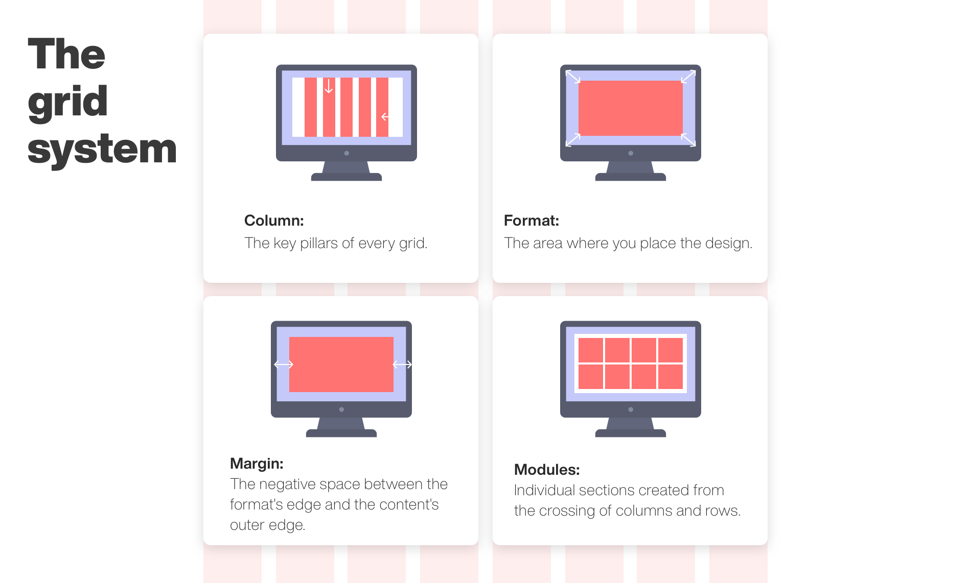
The grid system: how it works
Typically, you must divide the canvas into columns and define the layout. Instead of using pixels for every object, you use columns to determine how many of them each object must occupy. As a result, despite having a particular resolution, the items will fill the same number of columns, regardless of screen variations.
Breakpoints: a different stylesheet per resolution range
While the grid system helps adjust content to a group of screen resolutions, there are cases in which screen ratios and sizes are drastically different, like mobile versus desktop, and a new layout must be defined.
CSS breakpoints are defined in the stylesheets and apply a different set of styles to the HTML depending on the resolution. It helps to adjust content to a more suitable layout, improving the overall user experience.
Though they could be customized, there are standard ranges for mobile, tablet, and desktop. As a reference, these are the breakpoints proposed by Bootstrap.
Takeaways
Using a responsive framework enables us to adapt to common resolutions, allowing us to create a markup to keep the same proportions and stay true to the design. Likewise, breakpoints help us define completely different layouts, and they’re usually applied to tablets and cellphones.
If you’re going to develop a website or web app, you must keep this part of the process in mind, as it will impact all later development and the experience of your users. And if your boss or client asks you to make your project Pixel Perfect, show them this blog post! I’ll be happy to review it with them.
If you think we can help you with any project, get in touch. We would love to provide the highest quality experience to your users.
Damian is a passionate Computer Science Major who has worked on the development of state-of-the-art technology throughout his whole life. In 2018, Damian founded BEON.tech in partnership with Michel Cohen to provide elite Latin American talent to US businesses exclusively.
Explore our
Migrating Teams from Eastern Europe to South America
You’ve decided to migrate your team. Now, you’re probably wondering how to make the switch. Let’s find out. ..
 June 30, 2020
How Cutting Our Marketing Budget Made Our Sales Explode
Today, we consistently see up to 35% annual growth. But it wasn’t always like that. ..
 May 28, 2020
Our Most Valuable Resource
Our most valuable resources, nurturing us with their different looks, are our people. ..
 May 28, 2020